MyVM
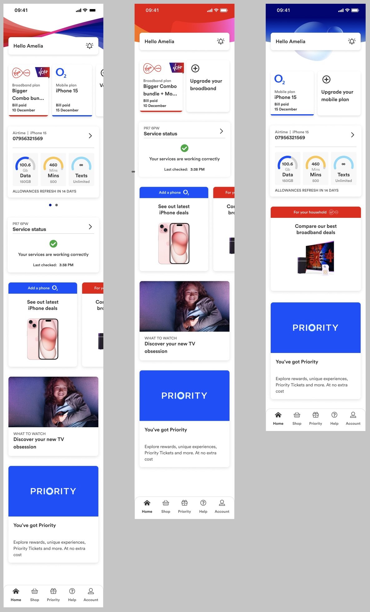
Bringing Virgin Media and O2 into one app so users can check their bills, find and fix any service or account issues, check their data usage, explore offers on products, and access Priority.
Giving the app a clean, accessible, and minimalist design, I used the two TOVs to write precise language – injecting more personality when possible.
In seven months we’ve created a working prototype from scratch and are close to our MVP.
Billing and payments
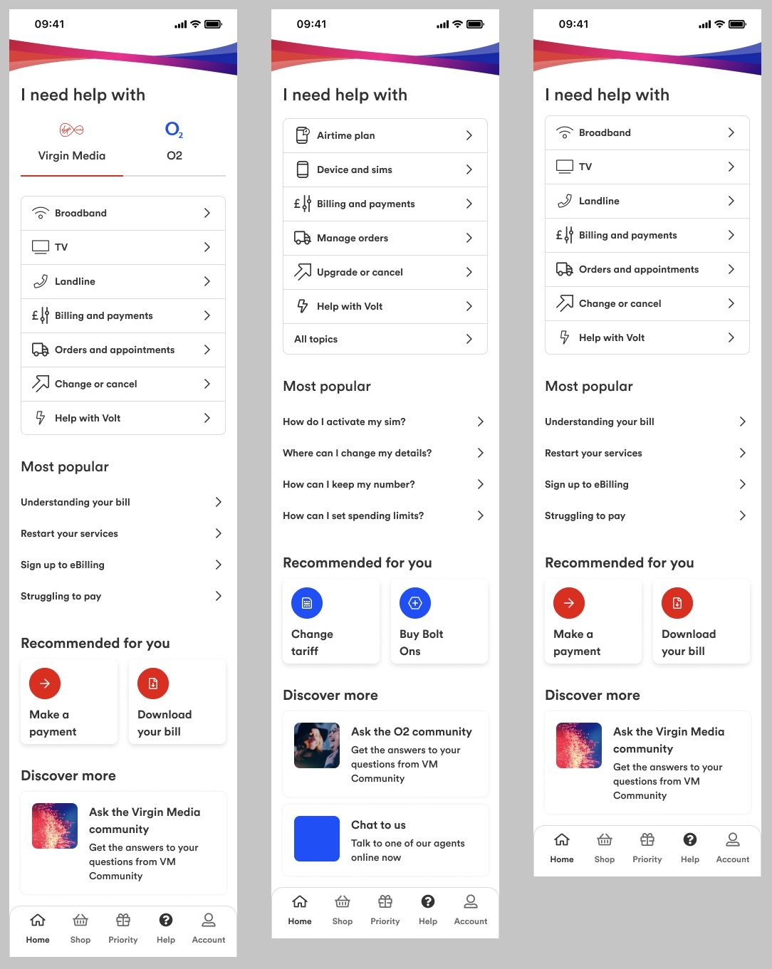
Help
Clean and minimal
I think there’s confidence in a minimal style. Making any page easy to read and navigate should be the top priority.
Product holding
Find the moments
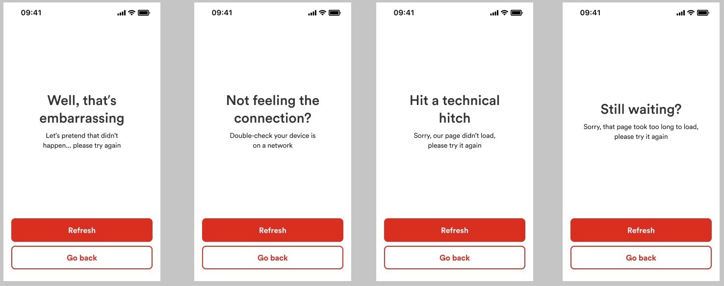
Error messages and loading pages are where brands can amplify their tone. They should inform and alleviate any frustration. For general errors I injected humour with a solution without exacerbating the problem.
Loading to error message
There are many correlations between gaming and design, for example, most loading screens for games give you hints and tips to get more value.
We used this for our loading screens when users have a slow broadband connection. Using 5 loading screens before the error page. Each one with a different tip to try to help the user.


